Matplotlib: Difference between revisions
From CommunityData
Add some links, for inspiration |
No edit summary |
||
| Line 5: | Line 5: | ||
In this session, we will explore how to produce clear, informative charts, graphs, and plots with [http://matplotlib.org/ Matplotlib], the most popular toolkit for scientific data visualization in Python. | In this session, we will explore how to produce clear, informative charts, graphs, and plots with [http://matplotlib.org/ Matplotlib], the most popular toolkit for scientific data visualization in Python. | ||
We'll start with the data-set created [http://wiki.communitydata.cc/Community_Data_Science_Workshops_( | We'll start with the data-set created [http://wiki.communitydata.cc/Community_Data_Science_Workshops_(Fall_2015)/Day_3_Lecture this morning] containing information about edits to the Harry Potter Wikipedia article. | ||
We will then proceed to visualize different aspects of data from the [http://wiki.communitydata.cc/Community_Data_Science_Workshops_( | We will then proceed to visualize different aspects of data from the [http://wiki.communitydata.cc/Community_Data_Science_Workshops_(Fall_2015)/Day_2_Projects/Socrata Socrata web API]. | ||
Revision as of 23:59, 4 October 2015

Visualizing data with Matplotlib
In this session, we will explore how to produce clear, informative charts, graphs, and plots with Matplotlib, the most popular toolkit for scientific data visualization in Python.
We'll start with the data-set created this morning containing information about edits to the Harry Potter Wikipedia article.
We will then proceed to visualize different aspects of data from the Socrata web API.
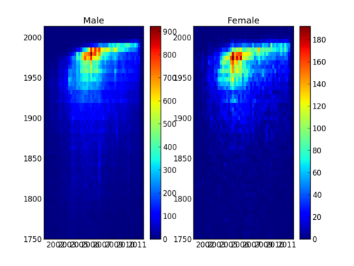
Inspiration
Goals
- Get set up to make graphs with Matplotlib
- Learn the basics of the Matplotlib API and workflow
- Practice reading the Matplotlib documentation
- Build a plotting program step by step
- Learn simple ways to distill the essence of a large data set
- Explore the art of visualizing data
- Exercise your creativity by making your own visualization
- IPython: an interactive python shell
- Download the CDSW Matplotlib code from here and unzip it on your machine.
- First plot: 001-hello-plot.py
- Subplots: 002-subplots.py
- Let's do something more interesting: 003-plot-timeseries.py
- Visit the Matplotlib gallery.
- Make another kind of plot: 004-plot-histogram.py
- Dive deeper into web APIs: 005-traffic-timeseries.py
- Play around with any/all the data you've seen! You can find some more examples in the wikibios folder.
References
- matplotlib API reference
- matplotlib Examples (many, with source)
- Other plotting resources
Example topics to cover in Lecture
- line charts
- histograms
- binning
- scatter plots
- heat maps
- axis labeling
- legends

