Matplotlib: Difference between revisions
m (Benjamin Mako Hill moved page Community Data Science Workshops (Fall 2014)/Day 3 projects/Matplotlib Session to Matplotlib) |
(Prettyplotlib is not being developed/supported anymore!) |
||
| Line 32: | Line 32: | ||
* [http://matplotlib.org/examples/index.html matplotlib Examples] (many, with source) | * [http://matplotlib.org/examples/index.html matplotlib Examples] (many, with source) | ||
* Other plotting resources | * Other plotting resources | ||
** [http://web.stanford.edu/~mwaskom/software/seaborn/ Seaborn]: fancy matplotlib-based visualizations | ** [http://web.stanford.edu/~mwaskom/software/seaborn/ Seaborn]: fancy matplotlib-based visualizations | ||
** [http://ggplot.yhathq.com/ ggplot]: port of the R language's ggplot2 library to python | ** [http://ggplot.yhathq.com/ ggplot]: port of the R language's ggplot2 library to python | ||
Revision as of 03:49, 7 May 2015

Visualizing data with Matplotlib and Wiki-bios
In this session, we will explore how to produce clear, informative charts, graphs, and plots with Matplotlib, the most popular toolkit for scientific data visualization in Python.
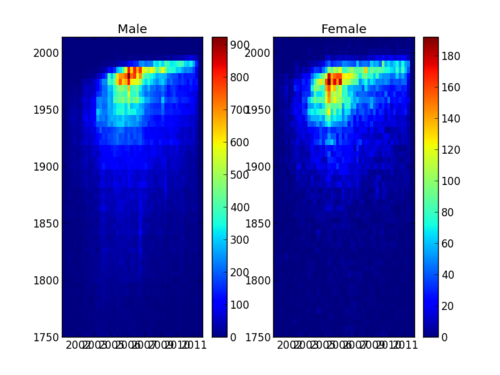
We'll be focusing on a dataset drawn from Wikipedia and , containing the names, birth dates, genders, article creation dates, and number of edits, of over 180,000 Wikipedia biography articles.
The dataset used here has been drawn from several sources. The list of biographies and the gender of the biography subjects comes from a datbase called DBpedia that is a structured database built from Wikipedia. If determines if articles are biographies from the Wikipedia category system and it determines if the subjects are male or female primarily by looking at whether subject is referred to as he or she in the article. Birthdates for people are extracted from the data recorded in Wikipedia in the "infobox" sidebars common to many pages. Data on how people edit Wikipedia is merged onto this dataset from a separate collection of metadata of Wikipedia editing very similar to the one we built for Harry Potter articles the morning.
Goals
- Get set up to make graphs with Matplotlib
- Learn the basics of the Matplotlib API and workflow
- Practice reading the Matplotlib documentation
- Build a plotting program step by step
- Learn simple ways to distill the essence of a large data set
- Explore the art of visualizing data
- Exercise your creativity by making your own visualization
Download and test the Matplotlib-with-Wiki-bios project
(Estimated time: 10 minutes)
After installing matplotlib, and downloading and unpacking the Wikibios bundle, move into that directory with cd. You can test your installation by running python histograms.py. If matplotlib is install correcting, a chart file named histograms.pdf will appear in the current directory.
Bundle with code for all platforms: http://mako.cc/teaching/2014/cdsw-autumn/wikibios.zip
References
- matplotlib API reference
- matplotlib Examples (many, with source)
- Other plotting resources
Example topics to cover in Lecture
- line charts
- histograms
- binning
- scatter plots
- heat maps
- axis labeling
- legends

